by ThinkCode | Oct 14, 2015 | Search Engine Optimization
Large sitemap.xml files should always be generated automatically. Typically it’s a CMS or ecommerce system on the backend. Typically there are plugins or modules available that will do it or you can write your own. We would HIGHLY recommend utilizing the <priority> element in the sitemap.xml to prioritize your pages so the engines know which pages are most important to be indexed, second most important to be indexed, third most important to be indexed, etc.
We agree that typically sitemap.xml files are not needed by most sites, they are indeed very helpful for most large sites. Ecommerce sites, for instance, may have hundreds of thousands of products. Those products might be linked to primarily from category pages DEEP in the site (could be 5,6,7, etc.) clicks from the home page.
Each site has both a crawl budget (amount of time and resources that the engine is going to dedicate to find pages on your site). The engines are typically also going to index only a certain number of pages on your site. Both of these are based primarily on the number and quality of backlinks the site has (i.e. PageRank).
So anything you can do to help the engines like Google crawl your site more efficiently (spend your crawl budget crawling pages you think are most important like product pages on ecommerce sites) and to influence which pages get indexed before others (using <priority> in a sitemap.xml) is advantageous for large sites EVEN if the site has great navigation.
Google has lots of limitations on sitemaps. 50,000 URLs per sitemap file. A sitemap index file can contain at most 50,000 sitemap.xml files. We believe the size of the sitemap.xml cannot exceed more than 50MB uncompressed and possible 10MB compressed.
How we can create/generate xml-sitemap file for the same.
Within Categories Options, set Frequency to Daily and Priority to 1.
Within Products Options, set Frequency to Daily and Priority to 0.8 (or anything less than 1 and more than we are about to set the CMS pages to).
Within CMS Pages Options, set Frequency to Weekly and Priority to 0.25.
Within Generation Settings, set Enabled to Yes, Start Time to 01 00 00 (01:00 a.m. or you can use another time that your traffic is at it’s lowest), and Frequency to Daily, and enter your e-mail address into the Error Email Recipient field.

by ThinkCode | Oct 12, 2015 | Wordpress
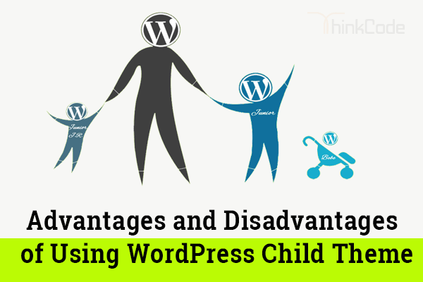
WordPress Child Theme means?
A child theme is simply a theme that inherits the functionality and looks of another theme or the parent themes.
A WordPress child theme means a WordPress theme that inherits its functionality from another WordPress theme or the parent theme. Child themes are often used when you want to customize an existing WordPress theme without losing the ability to upgrade that theme.
Designers and developers use child themes to speed up their development.
• If we create a child theme we will not need to create a new theme from scratch. Which help to increase the speed of development and reduction in time to complete task.
• You can avoid irreversibly damaging your site by using a WordPress child theme.
• A child theme automatically inherits the parent theme’s features, styles, files and templates.
• There are a lot of free theme frameworks available which give you a wide range of functionality will not need too much customization in our child themes.
• A child theme built on a theme framework allows a great deal of flexibility without writing many lines code.
• You forget to code for something, then there is always the parent theme’s functionality available as the fallback option.
• You will get benefit from updates to the parent theme without having to recode all your child themes.
Disadvantages of Using a Child Theme
• Disadvantage of using child themes is the time we need to invest to learn about the parent theme.
• You need to learn hooks and other functions that are used by parent themes or framework.

by ThinkCode | Oct 6, 2015 | Search Engine Optimization
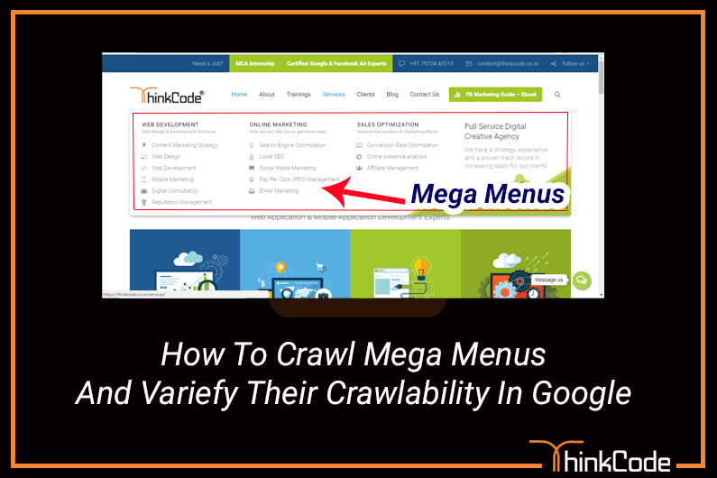
Google crawlers are designed from the beginning in a way to understand simple HTML codes, but when your mega menu created in complex code (Ajax or some other) will always be ignored though tried Fetch tool. Why it considers simple HTML code is that it needs things on your page simple for the users. Perhaps, complex code could be the culprit here, but wouldn’t cause any problem for your whole SEO practices and gaining good ranks.
Google should have no problem crawling mega menu assuming it is implemented with nested unordered lists (<ul> elements) containing anchor (<a>) elements in the various list items (<li>). If you’re doing something really weird like using complex AJAX calls or something to build them out then that might be an issue.
As per our knowledge the Fetch & Render tool in Search Console emulates what Google is now doing during the indexing process to determine what content is visible to users on initial page load. But Google also know what parts of the page are template (header, footer, left nav/sidebar if applicable, right sidebar if applicable, breadcrumbs) and what part of the page is the main body/content section. They fully expect that the top navigation might utilize dropdowns and that those dropdowns will always be hidden on initial page load. Just because they do not show in Fetch & Render does not mean that they are not being crawled for discovery and counted.
but if those webpages referenced inside the mega menu have been indexed and can be found in the SERP’s for the keyword phrases they’re targeting, then just because fetch and render doesn’t display them (within a menu) would not be an immediate cause of concern.
Apart from this make your menus logical and hierarchical if there are a lot of categories – users should be able to grasp the structure of the site from the way the menu is structured. They’ll feel more comfortable and stay on the site longer.
Google has been searching through JavaScript for over a decade to find URLs for discovery purposes. But in the last half decade or so they have gotten extremely good at actually executing JavaScript and its derivatives like AJAX. However, not all search engines are as adept at doing so. So if you want your navigation to be crawlable by all engines, it is recommended that you implement it with HTML. All search engines were designed to process HTML documents.
You can try at Weblogs to check where GoogleBot and other crawlers have been also Try awstats or Splunk.

by ThinkCode | Sep 28, 2015 | Miscellaneous
HTML has its limitations when it comes to layout designing. When it comes towards looking, It plays an important role in user interaction. These are good enough to get a reasonable looking document that shows the true structure of information on website. So for designing point of view CSS plays an important role.
There are many of advantages of Cascading Style Sheets. In fact, It has become the preferred web design method for today’s website design creators. You will be happy to know that it will not only benefit your website design, but it will also save you time and money.
Advantages of CSS:
- Search Engine Optimization: CSS helps to increase SEO and SEO is important for any website.
- Saves time: With CSS, you only have to specify these details once for any element. It will automatically apply the specified styles whenever that element occurs.
- Pages load faster: Less code means faster download times. And faster website loading time.
- Appearance: It makes it easy to improve the appearance of a website .By using it you can build well or good looking layouts. It helps to increase user experience.
- Easy maintenance: To change the style of an element looks across the whole site, you only have to make an edit in one place and your change will appeared on frontend .
- Bandwidth savings: Using CSS instead of tables for layout, a website can reduce its file sizes by up to 45%. This means decreased bandwidth costs. So the it helps in load speed also.
Note: Try to use CSS in one file instead of creating many files.

by ThinkCode | Sep 25, 2015 | Wordpress
As per the statistics on internet usage behavior reveal a very interesting fact — more than 60 percent of smartphone users throughout the world of internet use the internet through their mobile devices to get relevant information quickly, especially when they are away from their 1 computers . Around 40 percent of users browse the internet while traveling.
Possible Solutions for Device friendly Web Design
To address this challenge, there are two recommended way for UX designers:
- Responsive Website Design (RWD)
- Adaptive Website Design (AWD)
Responsive Web Design (RWD) is an approach in which a site is designed to provide a best viewing experience across all wide range of devices, from desktop computer monitors to mobile phones. Responsive Website Design has been widely adopted by organizations across the globe, but it is not the only solution for designing sites that must work across various media. Adaptive Web Design, for instance, is an approach for device friendly design. In other words, it comprises specific designs suited for specific media, such as mobile, desktops, laptops device and so on.
The preference to adopt RWD or AWD will depend on the business situation.
Responsive Web Design
The Responsive Web Design approach is adopted to provide a best viewing experience, which consist of easy reading and navigation with minimum resizing & panning. In other words, it is an approach that enables website design and development to respond to the users behavior and environment, based on screen size, platform, and orientation.
RWD comprises flexible grids, layouts & images, and makes intelligent use of Cascading Style Sheet media queries to adjust screen resolution & automatically resize images. The intention is to build a website that is resolution and device-independent.
Tools for Responsive Web Design
The main tools for Responsive Web Design are HTML5, CSS3, and JS, and jQuery.
HTML5: It is the most recent version of HTML, with features that provide device independence and error handling, and reduce the need for external plug-ins. HTML5 includes the features of HTML4, XHTML, XHTML1 and DOM2HTML. It’s a development framework with CSS3 and JS, along with a number of new elements, attributes, 2D & 3D graphics, video, audio elements, local storage.
CSS3: It is the latest version of the Cascading Style Sheet standard and is completely backwards-compatible with all earlier versions. CSS3 features such as orientation, device-width, min-device width, border-radius, opacity, box-shadow & text-shadow, it help create beautiful web pages which improve the user experience.
JavaScript and jquery: JS named css3-mediaqueries.js can help in the cases where browser versions and devices do not support CSS3 media queries.
The new intranet design should enable users to:
- Know who the go to experts are in the business
- Keep up with the latest updates within the organization
- Share information about best practices with employees
- Ensure that essential documents are updated
- Access important policies while on the road
- Act on pending requests round the clock
- Access the site through any device
A few best practices that should be followed to make a responsive
- Create a base site prototype with the help of a standard HTML editor & then use a responsive framework like Twitter Bootstrap help to convert the prototype into a responsive.
- Wherever possible, use the grid system to save time instead of building your own grid systems.
- Replace all pixels with percentages in the layout design.
- Use CSS3 and Media Queries richly for styling output.
- Avoid table-based layout design and browser-based HTML, JavaScript, and font tags.
- Create device channels based on matching User Agent.
- Create a set of image renditions that each image will automatically follow.
Conclusion:
Making a design responsive is relatively easy and more productive than developing code for every device available. With Responsive Web Design, we can create custom solutions for diverse set of users on a wide range of devices.


