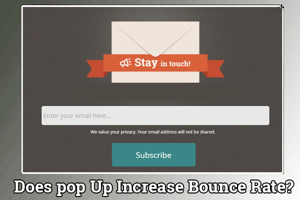
When it comes to pop up, the most common answer we hear by everyone is “we hate them”. The reason people hate them so much is because most pop up are done in a wrong way. They’re intrusive, demanding, they dominate your experience and force you to take an action when you’re least interested.
The popup strategy is the main cause of reader/visitor frustration and hence, increased bounce rates. For example, you land on a website that promises an in-depth article on ‘growth hacking’. But the moment you land up on the website, they bombard you with popups asking you to ‘subscribe’ or ‘check out this latest post’ or ‘sign up’ on their platform. Now that is what kills the conversions and skyrocket the bounce rates.
Today, people seek information first and then want to commit to a business. So the strategy that says ‘convert beforehand’ is wrong. The strategy that says ‘let them consume the information and then convert’ is the one that succeeds.
However, done correctly they can drive a lot of value for businesses AND for customers which is why many marketers say pop ups are driving amazing results for them and that they’re constantly looking at ways to improve them.
Now here are a few things we have noticed while working with those who do sign up with us:
– Don’t show the popup within the first minute or two of browsing
– When you target a reader at the end of a blog post or when she or he is trying to exit the website with a simple ‘please share it on FB campaign’ popup, they’re more likely to do it. (If they have actually liked your content)
– When you target the reader/visitor based on an action, scroll point or time spent on the website, in a contextual manner, he is more likely to convert.
– Don’t make the popup cover the whole page: it’s frustrating, confusing. Not many people can get away with this.
In simpler words, we think timing play major role in such case. Before you ask for something, you need to add value to the reader/visitor.


